VIDEO and FREE TRIAL
Qlucore Omics Explorer video
Qlucore Omics Explorer free trial
Are you looking for a faster way to create the best visualization of your important findings? Qlucore is different from all other data analysis software tools as it centers around the visualization of data. It always starts with a plot.
Qlucore Omics Explorer 3.9 (QOE) offers 15 different types of plots. The Violin plot is the latest addition in the new release, and many of the plots are optimized for omics data analysis. If you already have QOE, you simply need to update your version to take advantage of the new plots.
With just a few clicks, the plots are configured to your liking. If you need to..
… change the content by applying a filter or change the statistical test, the plot is automatically updated.
… keep track of done changes, use the log functionality.
… know exactly the calculation for the actual plot, use that specific status window.
… have the same data but visualized in different ways, use the synchronized plot option.
Genome browser and circular plots for gene fusions are also available with the NGS module add on.
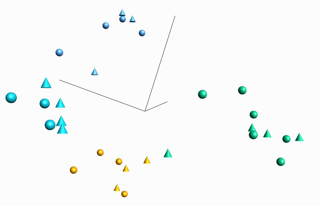
The guide below highlights how to use some of the powerful plots such as heatmaps, PCA, UMAP, Violin t-SN, and 3D PCA plots – for exploration and cluster analysis for any type of omics data.
Heatmaps – for exploration, analysis, and visualization of both samples and variables. The heatmap is interactive and will automatically display all your active variables.
UMAP and t-SNE – for cluster analysis, fast and efficient to analyze for instance single-cell RNA-seq data.
Violin plots - visualize the distribution of samples in a group and show how the distribution varies between groups. Complements the Box plot.
Kaplan-Meier - used to visualize survival data - showing how survival in a group of subjects changes with time.
Venn diagrams - an excellent way to visualize overlap and interaction between lists.
Volcano - separates and displays your variables in two groups, upregulated and downregulated.
Scatter, Box, Line, Pie chart, and Bar – tune, fine-tune and present results.
Talus, Scree, and histogram – to estimate dimensionality and distributions.
Register for the upcoming webinar “Analyze qPCR data in Omics Explorer”.
August 29th, 2023
15:00 GMT (+1)
Register for the upcoming webinar “Basic Training: Get started analyzing data”.
September 7th, 2023
14:00 GMT (+1)